The challenge
Fiamma struggles with low sales and inefficient service.
Customers found the menu difficult to read and gravitated towards a few familiar options. Further, staff reported slow service due to customer questions.
Within 3 months, Fiamma saw measurable improvements
- $74k+
- increase in revenue
- 112%
- increase in cocktail sales
- 47%
- increase in Secundi sales
- 338%
- increase in wine by-the-bottle sales
Keep reading to see how.
Food menu
Problem 1: Customers don’t order enough dishes
Insight
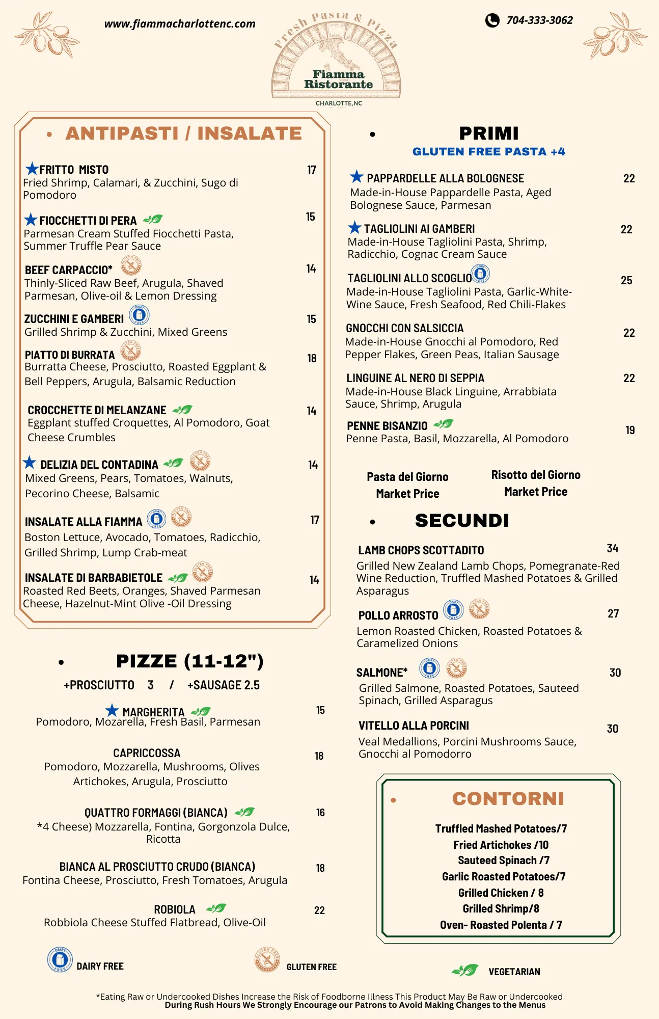
Fiamma is designed to be a 4 course dining experience, yet, we found 91% of Fiamma customers order <3 courses. Analyzing the menu, I found that it didn’t clarify the four-course experience. The Antipasti/Insalate section seemed separate, but the other three courses (Pizze, Primi, and Secundi) were indistinguishable. I realized that customers were ordering fewer courses simply because they didn’t know there were multiple courses.
Iteration
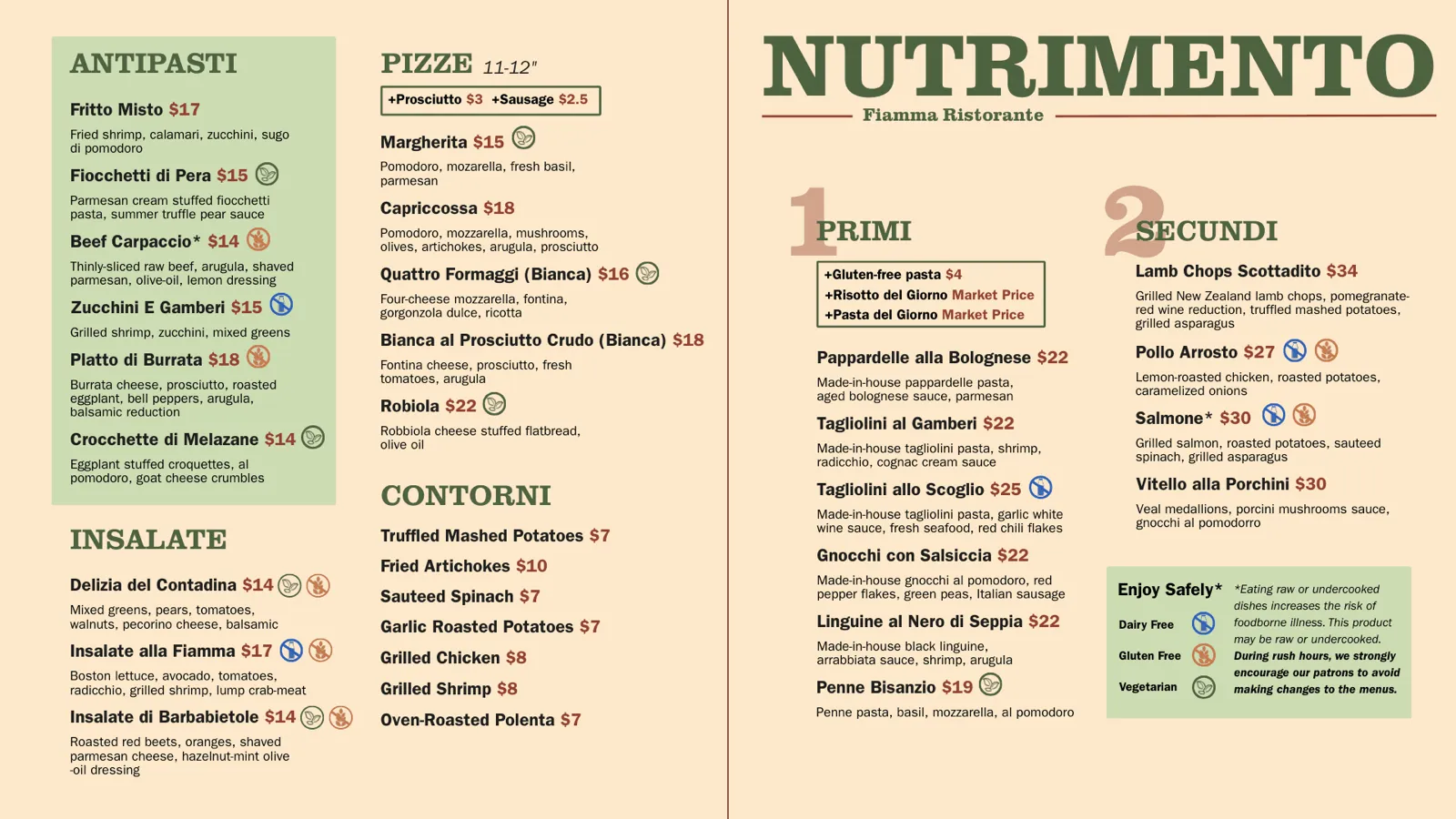
I explored various ways to communicate the four-course structure. At first, I used explicit numbers and labels, but this design made the menu feel tacky and crowded.
Final Design
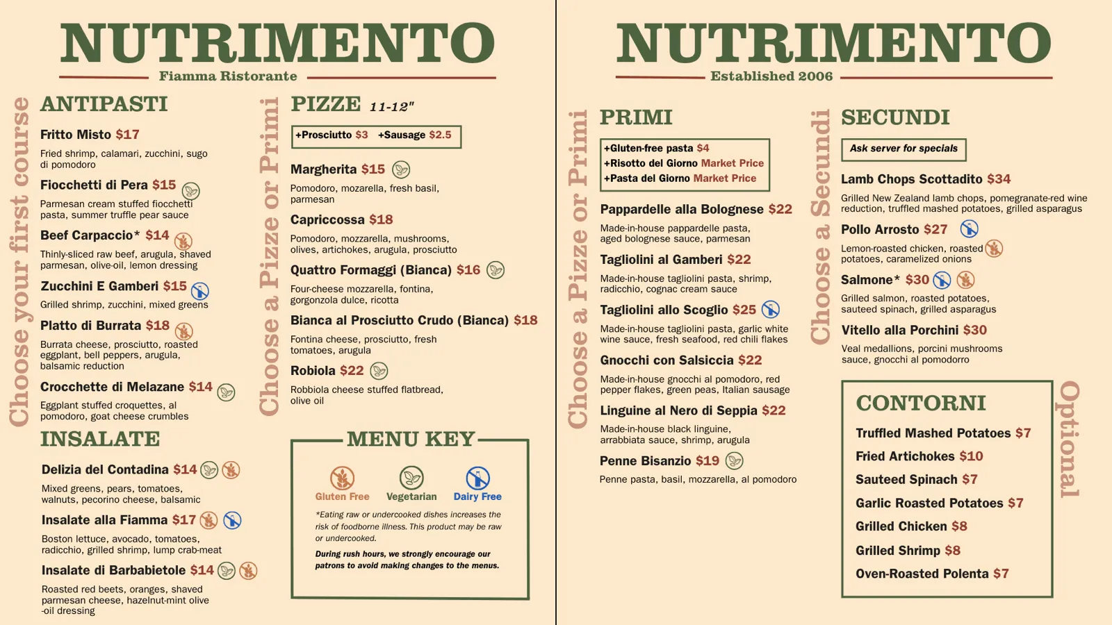
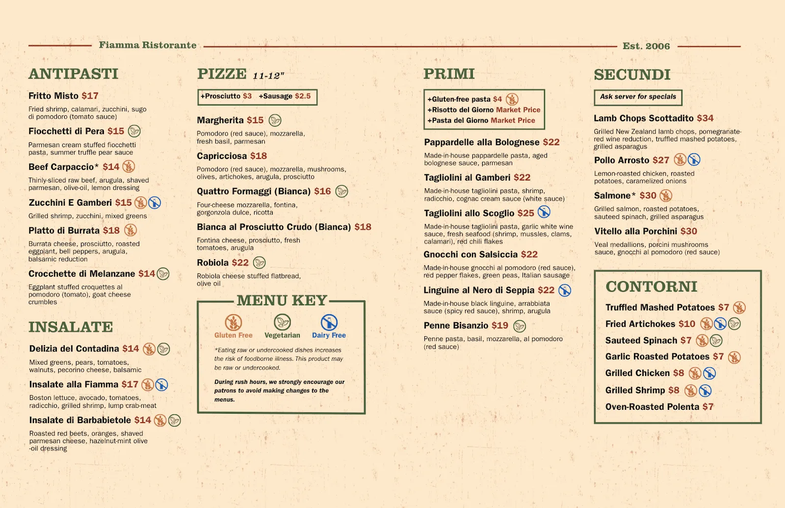
I took away the unnecessary labels and returned to using proximity and symmetry principles to create separation between each course. I ordered the courses from left to right, following how customers would naturally scan the menu, and used consistent bold section headers to anchor each section. To avoid confusing the Contorni section as another course, I differentiated it with an outline.
Results
- 47% increase in fourth course sales
- Decrease in questions asked about how to order
Problem 2: Customers complain about slow service times
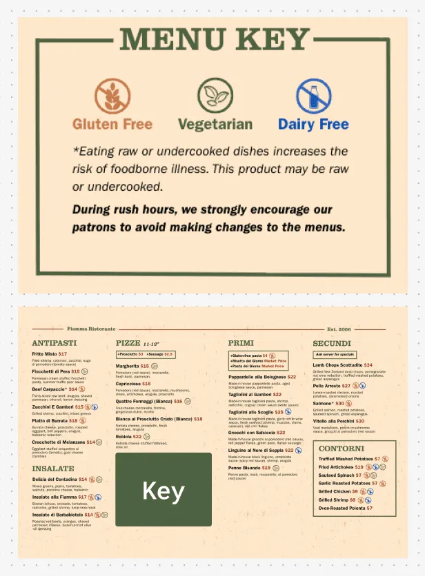
Josh reported that servers were being slowed due to questions about allergens, causing slow service times. I examined the menu and noticed that the allergen information was at the very bottom, where it was easy to miss. Further, the icon alignment was inconsistent and certain sections lacked any allergen information at all.


I first addressed the basics, fixing misalignments throughout the menu and adding allergen information to the “Contorni” section and to add-on items, so customers with allergies could quickly scan the menu and see their options. Then, I simply replicated the old key with better alignment and icons (Francesca worked on the icon redesign). But, I noticed that it still seemed to disappear into the rest of the menu.

So, I began experimenting with ways to make the key stand out. I experimented with changing the placement of the key, along with adjustments to the key itself including typography, colors, and shapes.
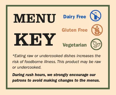
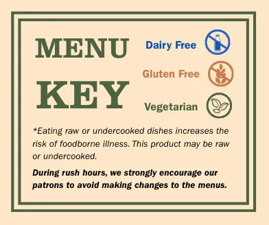
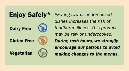
In the final design, I placed the menu key in the bottom-center of the menu, where customers could not miss it. I used bold text and a thin green outline to draw attention to the key, while not overpowering the food listings.
Within the key itself, I placed the icons in the top-center followed by the notes to create a visual hierarchy emphasizing the icons. I added generous padding, making the key easily readable and creating an open, relaxed feel.
This significantly reduced the number of allergen questions asked and made service faster and more efficient.
Cocktail menu
Problem 3: Customers do not order cocktails
Despite Fiamma’s extensive cocktail menu, only 7% of all drink orders are cocktails. I identified key pain points from the cocktail menu that were contributing to this issue. Simultaneously, Josh conducted user research which emphasized a lack of information around cocktails as a key barrier to ordering.
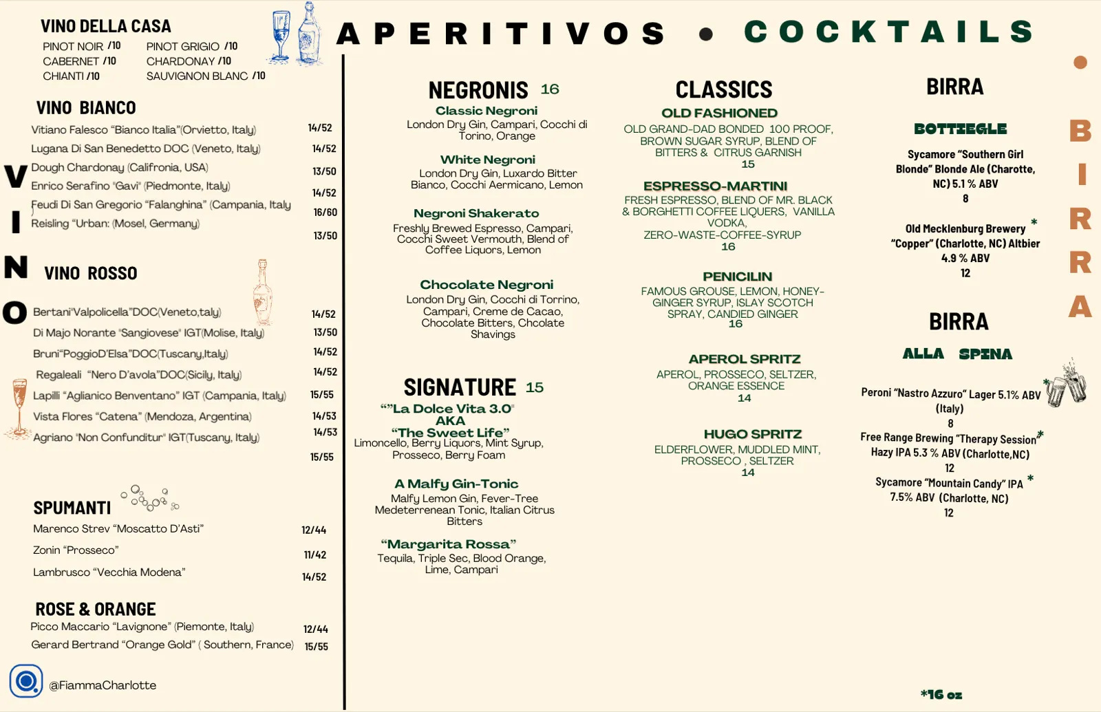
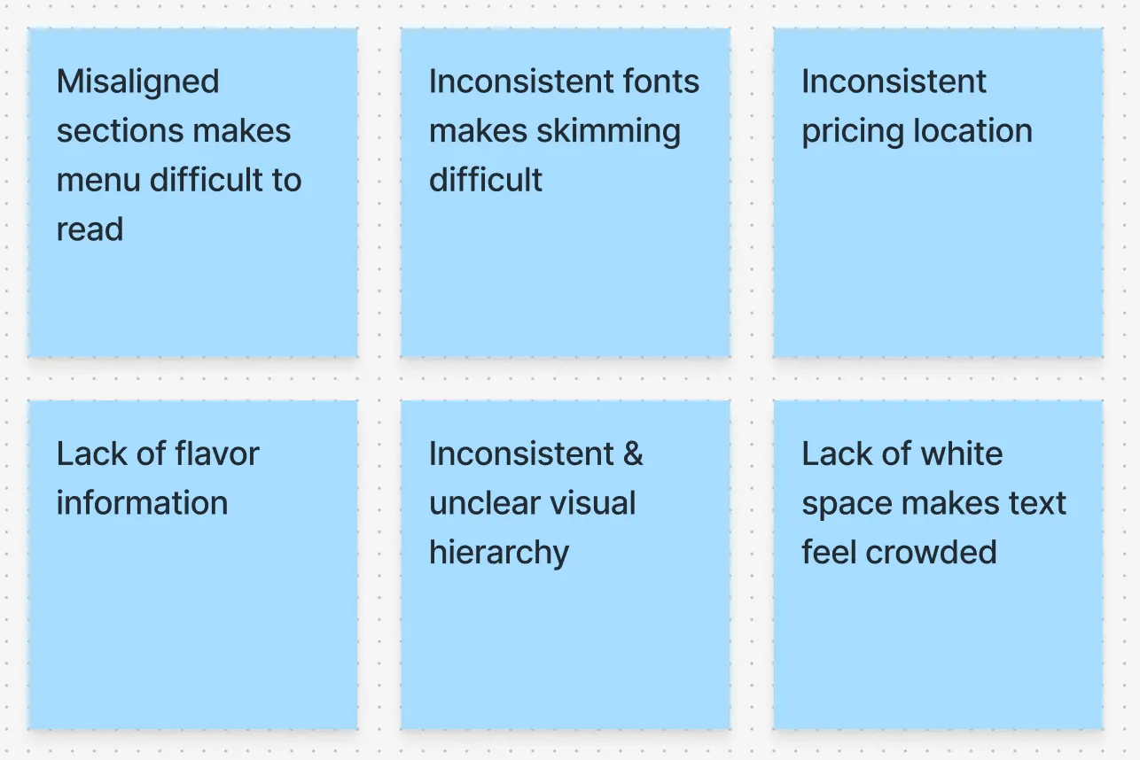
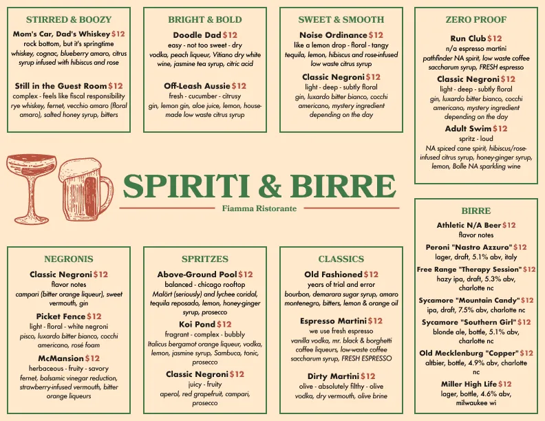
Since a lack of information was one of the crucial blockers to cocktail sales, I first focused on packing more information into each individual drink entry. Working with Josh, I added 3 flavor notes to each drink (i.e. easy – not too sweet – dry) to guide less experienced drinkers.
With more information in each entry, alignment and visual hierarchy became essential. I used subtle differences in text style, size, and color to differentiate the various layers of information.
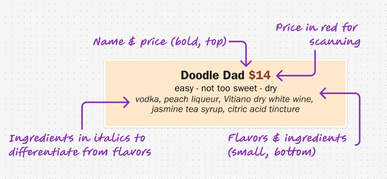
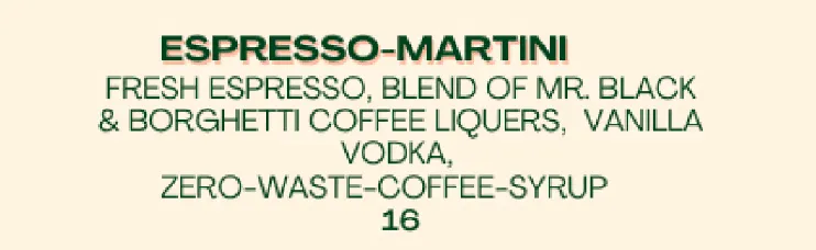
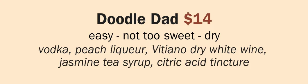
After solidifying the individual drink design, I turned to Canva to experiment with the shape and layout of the whole menu. I organized the drinks into simple flavor profiles (i.e. bright and bold) and played around with different Gestalt design principles to draw attention to these groupings.
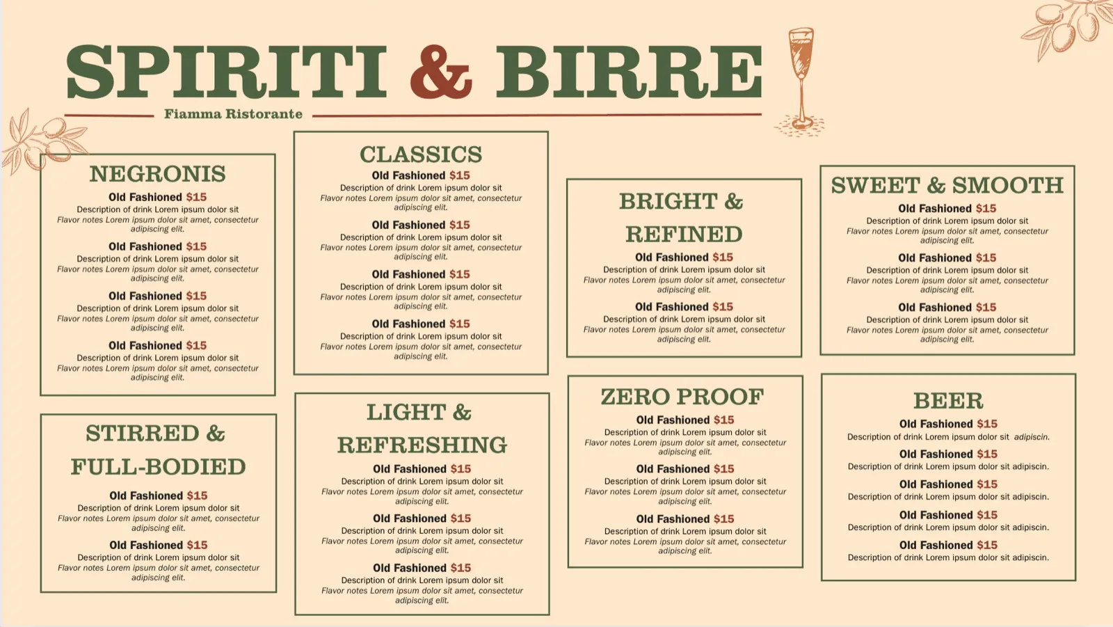
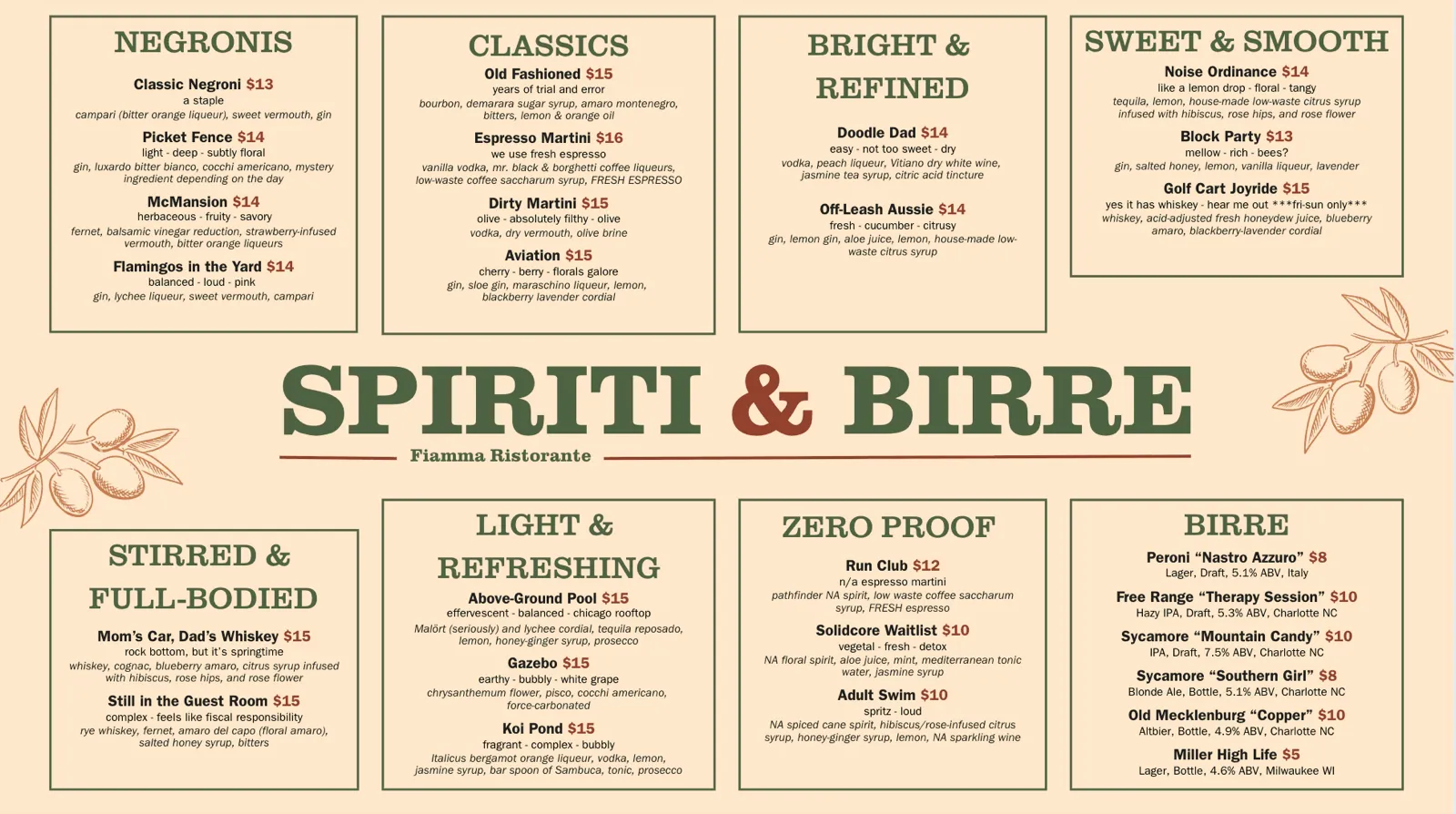
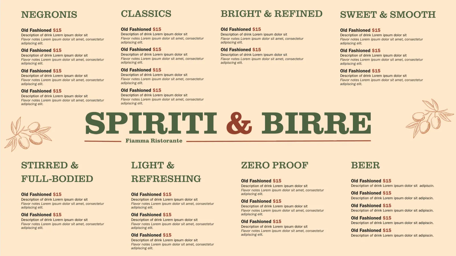
After finalizing the layout, I moved to Figma to create a high-fidelity component-based menu that could evolve with Fiamma’s changing offerings while maintaining a consistent style and hierarchy. The final result was a cocktail menu full of rich details to guide customers to their drink choice, while still being easy to quickly scan and navigate.
Wine menu
Problem 4: Customers do not order wine by-the-bottle
Similar to the cocktail menu, the wine menu lacked clear hierarchy and sufficient information to help customers order confidently, leading to lower engagement. A sales analysis revealed that only 10% of drink sales were wine by-the-bottle. My goal in redesigning was to add meaningful details to the listings while organizing the information in an intuitive way.
In the redesign, we added 12 new wines and incorporated more information into each listing. Thus, my first issue was how to pack so much information into one menu without creating visual overwhelm.
I first worked on the individual wine entry. Following my method with the cocktail entries, I played with different text sizes, colors, and styles to differentiate the information.

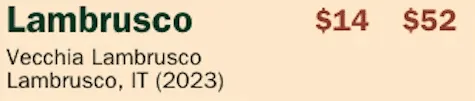
I then went through many rounds of iteration, experimenting with how many wines each section could comfortably hold before feeling dense. Once I found a few layouts that worked, I tested different design touches (i.e. highlight, boxes, icons) to help customers identify special details (i.e. house wines, zero proof wines, by-the-bottle wines) without cluttering the menu with more text.
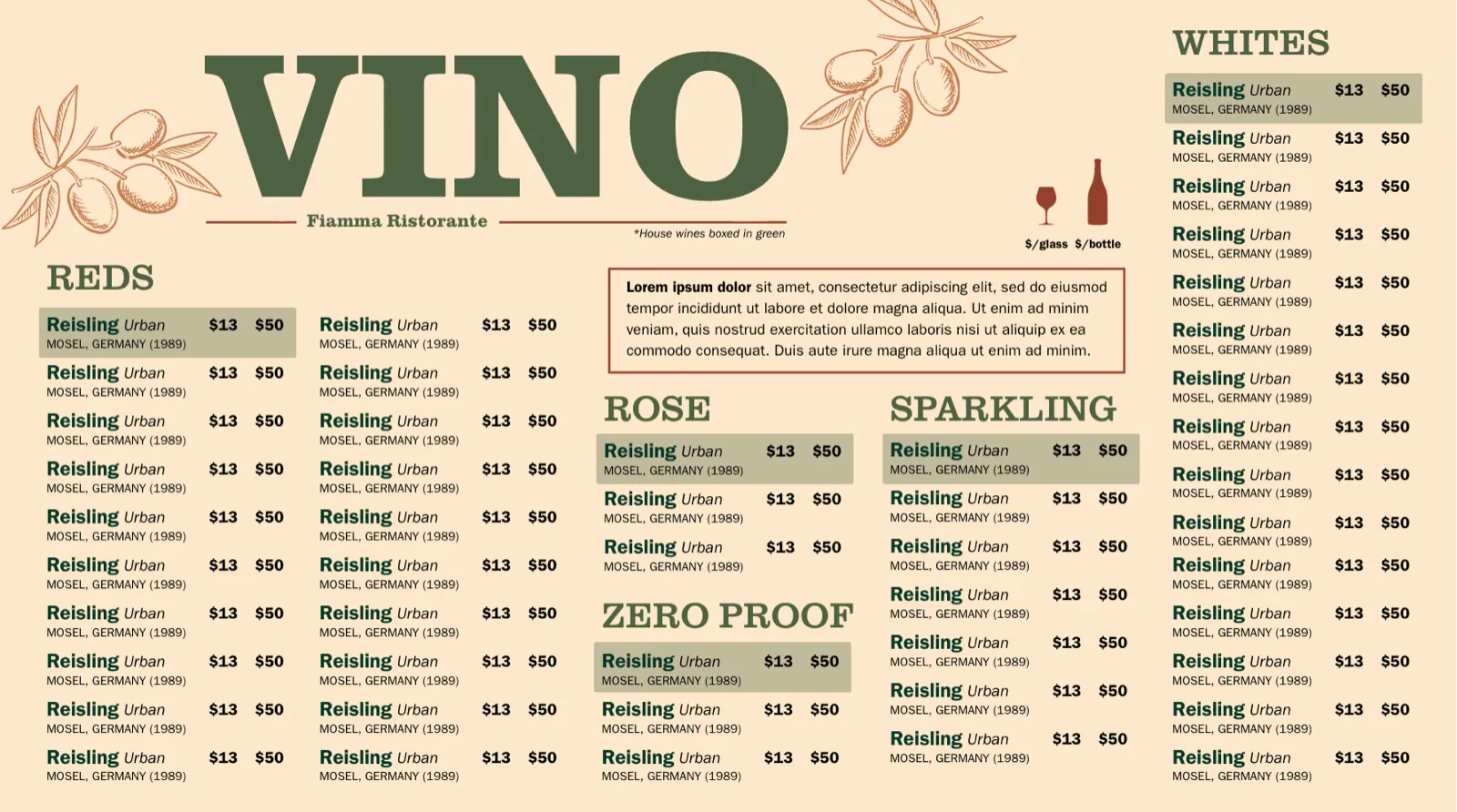
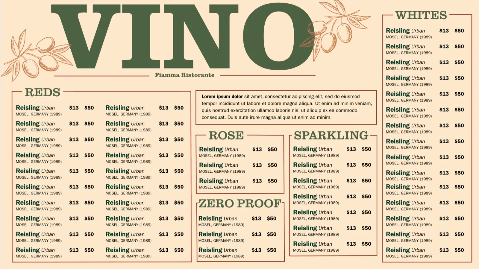
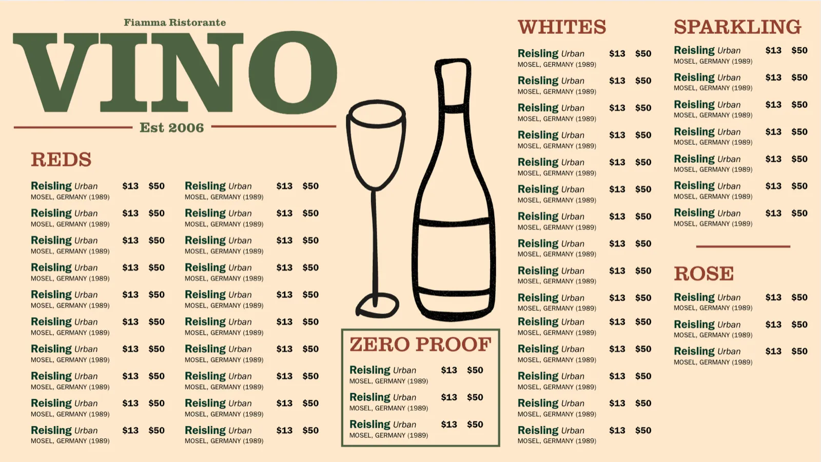
The final menu separated the zero proof category, introduced 12 new wines, emphasized the by-the-bottle option through large icons, added a pairing note to guide less familiar guests, and included more details for each wine.
Reflections
This project was a ton of fun and I’m grateful to my co-designer Francesca, and our partner, Josh, for the opportunity to learn to use design in a unique, non-digital industry!
Here are some things I learned from this experience:
Canva as a design tool
This was my first project drafting design drafts in Canva. I learned a ton about how to use Canva and grew to really appreciate how I could quickly draft up tons of hifi-esque first drafts.
Gestalt principles
During this project, I turned to gestalt principles to turn dense clumps of information into clear, easy-to-digest layouts. This experience deepened my understanding of how visual hierarchy shapes the way people process information.
Figma components
As we began transferring designs to Figma, I relied heavily on components and variants. Through lots of trial and error, I learned a lot about components and feel much more confident in my skills!
Your menus are the only reason we can survive busy nights and contributed to the $48,104 of additional revenue the restaurant had this year since having your menus
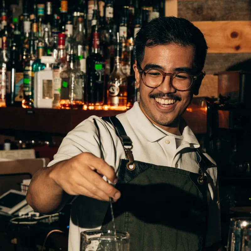 Joshua OcampoCreative Director, Fiamma